
Albert Einstein@relativity · 2h
Design systems are like physics. The rules must be consistent across every frame of reference, or the whole model falls apart.
1841.2K9.4K240K
Starter screens that prove the system carries across industries. Each is composed only from Savant tokens and components, so the same foundations dress a trading desk, a video feed, an AI assistant, and an inbox. Every side-nav tab opens a real screen, and every app wears the Average Genius mark.
A portfolio and trading view. Dense figures, status colors for gains and losses, and a chart that reuses the data visualization set. Every rail tab is its own screen.
A browse and watch home. A search-first top bar, a category rail, and a responsive grid of thumbnails. Each rail tab opens its own screen.
 Streamline
 14:22
14:22 8:47
8:47 22:05
22:05 17:39
17:39A conversational assistant. A history rail, a threaded exchange, a model switcher, and a composer pinned to the bottom. Each saved conversation and New chat opens its own thread.
Use three tiers. Primitives hold the raw palette. Semantic tokens map intent onto them, like surface or text. Component tokens reference the semantic layer.
A theme only remaps the semantic and component tiers, so primitives and markup stay put.
Number the primitives, 100 through 900, so the scale stays neutral and mechanical. Name by role only at the semantic tier, where purpose lives.
That way "purple-600" never leaks into a button, but "color-primary" can.
Body text needs 4.5:1 against its background. Large text, 18.66px bold or 24px regular and up, can pass at 3:1.
Icons and UI borders follow the 3:1 non-text rule.
Flex lays out one axis at a time and lets content decide the sizing. Reach for it in toolbars, rows, and anything that wraps.
Grid defines both axes up front. Use it when the layout is a known structure, like a page shell or a card matrix.
Default to an ease-out for entrances, so motion starts fast and settles. Something near cubic-bezier(0.22, 1, 0.36, 1) reads as responsive.
Keep durations short, 150 to 250ms, and always honor reduced-motion.
Ask about tokens, components, accessibility, or anything in the system.
Savant can make mistakes. Verify important details.
A three-pane inbox. Folders, a scannable message list with unread state, and a reading pane. Every folder opens its own list and reader.
Jordan,
Given the deadline curves, I think we can bend the schedule without breaking it. Time is relative to the observer, and to the observer holding the Gantt chart, we have more of it than we feared.
Let us hold the review Thursday. I will bring the proofs.
Albert

Jordan,
Drew it from four angles. The mechanism should hold under load, though I would test the joint before committing. I have mirrored the notes so only you can read them.
Leonardo
Albert,
Thursday works. Bring the proofs and I will bring the roadmap. If the schedule really is relative, let us pick the frame where we already shipped.
Jordan
Charles,
On second thought, let the strongest component survive the review and we will deprecate the rest next sprint. Adaptation beats a rewrite.
Jordan,
Shipped the ninth iteration. I could not hear the feedback, so I trusted the structure. When the system is right, you do not need to hear it to know it holds.
Ludwig
A kanban for planning work. Columns by status, cards with an owner, labels, and priority. The Board, Timeline, and List tabs are three real views of the same sprint. Introduces the Kanban board component documented under Data display.
Savant 2.0Sprint 14Audit color contrast across the dark theme
Spinner is invisible on older Safari
Write the token migration guide
Templates section for six industries
Custom select keyboard navigation
Segmented theme control
Animated progress bar
Chart hover tooltips
A timeline. A composer at the top, posts with engagement counts, and a discovery rail. Every left-nav tab opens its own screen. Introduces the Feed post component documented under Data display.
Design systems are like physics. The rules must be consistent across every frame of reference, or the whole model falls apart.
Shipped a component today. It will either survive contact with users or it will not. Either way, the system adapts.
Measured the whole system against the dark surface. And yet, it passes contrast.
Albert Einstein and 8 others liked your post
Design systems are like physics…Michelangelo followed you
Isaac Newton replied to you
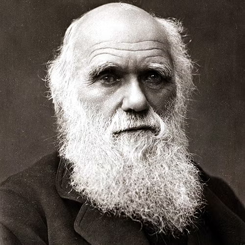
Every action item has a reaction, including this one.Charles Darwin reposted you
Sounds good, Thursday it is. I will bring the proofs.
Sent the blueprint. Let me know if the joint holds.
Merged. The third law held up in review.
The metrics do not lie. Shipping it.
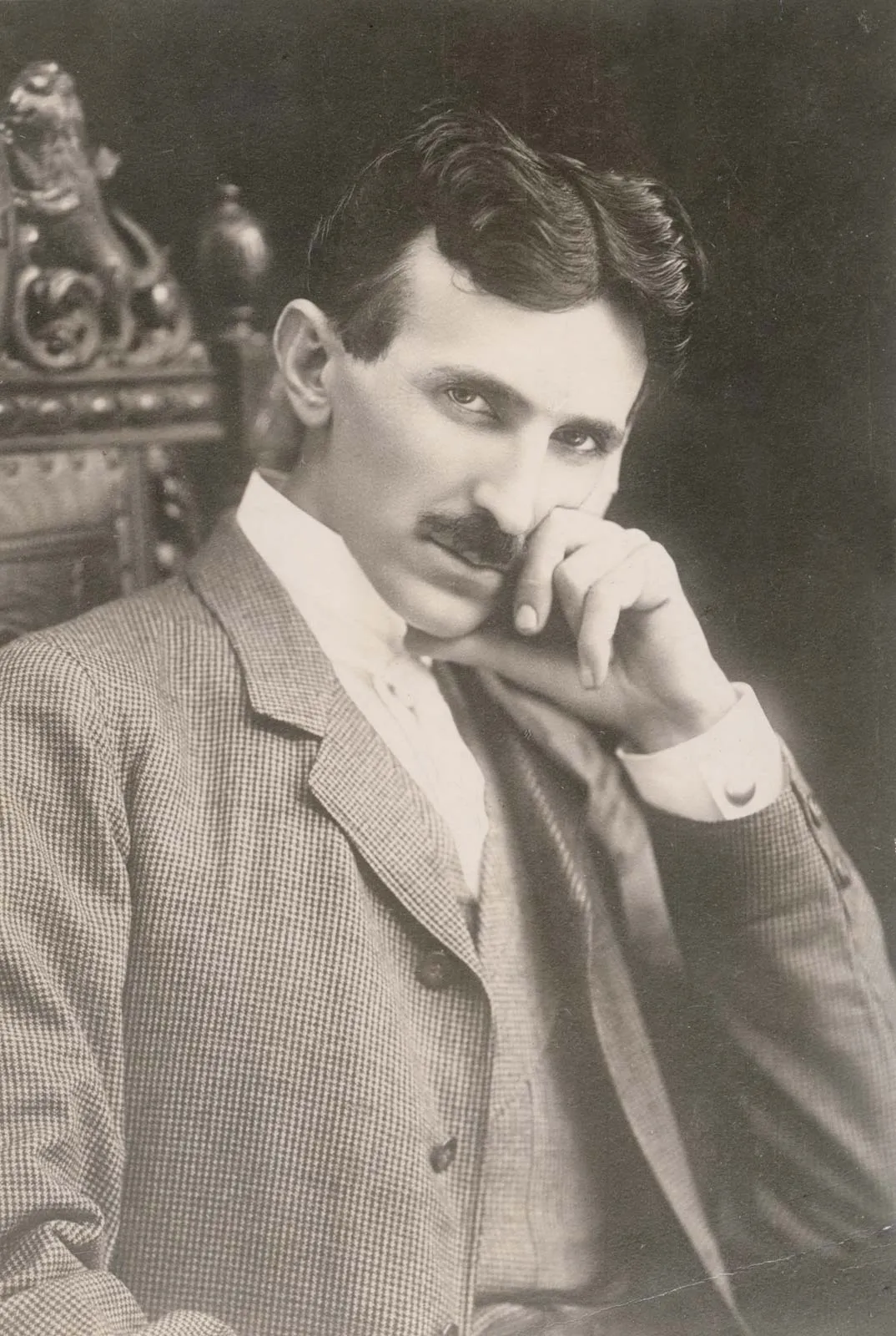
Inventor. Building the wireless future one resonant circuit at a time. Alternating current enthusiast.
The present is theirs; the future, for which I really worked, is mine. Also, the design tokens are mine.